End of pandemic phase for Europe and the US?
In November 2020, modelling by Rex Briggs predicted an end to the Pandemic in Europe and the US in Q3, 2021.
In November 2020, my model predicted an end to the Pandemic in Europe and the US in Q3, 2021. The definition I used for the end to the pandemic was deaths dropping to levels below that of a bad year of the Flu. In other words, deaths of less than about 7 deaths per million per week.
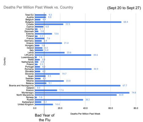
Over half the countries in Europe are below that level today (Chart 1). The EU, overall, is at 9.2. Many countries in the EU are doing better (16 countries in the EU are below 7). Three EU countries pull up the average significantly (Bulgaria, Romania and Latvia are experiencing significantly worse outcomes recently). Overall, recent deaths per million per week in the EU are below most of the non-EU countries. In sum, the EU overall is close, but not quite below the level of a bad year of the flu. Countries like Denmark have declared an end to the pandemic in their country. With deaths at less than 3 per million per week, it's a reasonable pronouncement.
Countries like the UK, which is at twice the death rate of a bad year of the Flu, aren’t out of the pandemic just yet.
Chart 1: Reported Deaths Per Million For Week Sept 20 to Sept 27
Among the countries with levels above a bad year of the flu for deaths per million per week, my model predicts most are close to the peak in COVID-19 deaths for this wave, and likely to see a steep downtrend by the end of October.
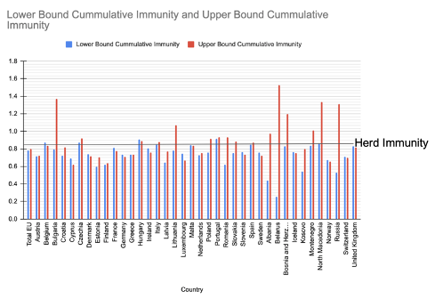
The downtrend will be due to a combination of vaccination rates and recovery from infections producing so-called herd immunity. In Chart 2, I plot my estimate for cumulative immunity. The countries not yet close to peak are Greece and Latvia. With a combination of relatively lower vaccination rates and lower immunity from recoveries, it will likely be a few more months of COVID-19 deaths at their current levels (or potentially higher), before these countries see COVID-19 deaths fall to levels similar to a bad year of the Flu. Increased vaccinations, masking and testing could better manage the risk in countries with cumulative immunity below 85%.
My projection is based on my analysis of the downward pressure on COVID-19 deaths as the total population approaches 85% cumulative immunity shown in Chart 2. My model is far from perfect (see Calculation sidebar for details), but it does give a data informed estimate of risk.
The further below the “Herd Immunity” line, the greater the risk that cases and deaths will occur in a fall/winter wave. Countries like Belgium and Portugal, which are at or above the 85% line for both the upper and lower bound have less risk of hospitals filling up and COVID deaths exceeding the rate typical of a bad year of the flu.
Countries like Finland, Estonia, Norway, Switzerland, Denmark and Germany have greater risk, as both the upper and lower bound estimates are below the 85% herd immunity threshold. Countries with a wide range between upper and lower bound, like Belarus and Russia have such poor data it is difficult to assess risk. The herd immunity line is not an on off switch. Rather, it is a curve, where risk decreases as a country approaches and passes the 85% level. Countries are not homogenous. Consider the regional differences within a country. It is possible to have a great overall vaccination rate and overall cumulative (herd) immunity, but still have pockets of low vaccination and low overall immunity. In such areas, flare ups are highly likely this fall and winter. Expect it. Plan accordingly. Even if masks are no longer required in a country, it is prudent to wear one when in areas with lower vaccination rates.
Chart 2: Herd Immunity Estimates
Herd Immunity Calculation:
Cumulative immunity is my calculation that combines those fully vaccinated and those that have immunity based on recovery from infections. It is difficult to know the total percent of the population that has recovered from SARS-CoV-2. Serology studies provide a good measure, but the studies are not available in each country. Therefore, I used my model that takes total deaths and divides them by the Infection Fatality Rate (IFR). Not every country accurately reports every COVID deaths. The Economist found countries like Russia and Belarus are likely undercounting, based on excess mortality. Belarus by a factor of 15 (1500%) and Russia by a factor of 4 (400%). The EU overall is likely undercount by only about 10%.
I created an upperbound and lowerbound and applied the Economist excess mortality multiplier with my IFR for the upper bound and the officially reported COVID deaths (as of Sept 28) divided by my IFR for the lower bound. For the EU, my calculation produces an estimate of 43% to 49% of the population likely infected and recovered from COVID-19. When combined with those fully vaccinated, using a random duplication calculation, my model suggests the EU is at 78% to 80% cumulative immunity.
My IFR is based on my analysis which found 0.4% -- but that is based on good health care. Not every nation’s health care is equivalent. Lacking a method to calculate each country’s Infection Fatality Rate, I used 0.4% as a constant. For the EU overall, it is likely a reasonable assumption. But, the following countries show evidence in my model that their IFR is significantly worse than my IFR constant: Belarus, Bulgaria, North Macedonia, Russia, Bosnia and Herzegovina, Lithuania, Montenegro. The evidence is an upper-bound infection based immunity projection exceeding 100%. One could improve on my estimates with a randomized serology study, which can better estimate the percent of the population that has recovered from infection. This value is the denominator and deaths in the numerator in calculating IFR. The countries where we’d most benefit from a better measure of IFR may be countries least likely to carry out well designed randomized serology studies to shed light on whether the fatality rate from COVID is higher than the average in developed countries.
Each country should work to increase vaccinations and maintain best-in-class contact tracing to control any outbreaks that may occur this fall and winter. Doing so can allow each country to keep the deaths per million per week similar to a bad year of the flu.
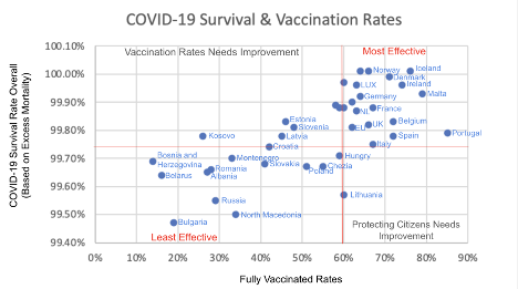
Some countries can be classified as having a relatively effective response to COVID-19 (see Chart 3). Less of their citizens have died since the pandemic began, based on the Economist analysis of excess mortality data (Y-axis) and more of their citizens have been fully vaccinated (X-axis). Iceland, Denmark and Ireland are good examples of countries I classify as Most Effective in Europe. There are advantages to being an Island: In addition to Iceland, Cyprus, Ireland and Malta all classified as Most Effective. Since not every country in the Most Effective category is displayed, you can see the complete list here. The EU overall can be classified in the “Most Effective” category, though there are some exceptions within the EU.
Countries my analysis classifies as “Less Effective” are ones where a larger percentage of the population has died since the pandemic began based on excess mortality and fewer of the citizens are fully vaccinated either because of lack of distribution or lack of trust in their government to take the vaccines that are available. Bulgaria, Russia and North Macedonia are examples of the Least Effective countries in Europe.
Chart 3: Population Survival Rates (1 - Excess Mortality) & Vaccination Rates in Europe

Note: Due to space constraints, not all of the most effective countries are shown. To see the raw data, and classification, visit the viewable and downloadable spreadsheet.
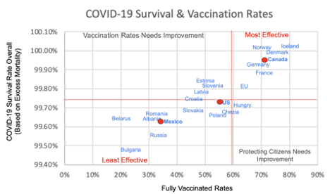
As a point of comparison to North America (Chart 4). Canada looks a lot like the Most Effective countries in Europe. Mexico is among the Least Effective. Mexico sits somewhere between Albania and Poland in terms of excess mortality and vaccination rates. In particular, for Mexico, vaccination distribution and administration needs significant improvement.
The US falls in-between Mexico and Canada and can be classified among the Least Effective. This is largely due the way that specific states have handled the 4th Wave Surge, which can be characterized as a pandemic of the unvaccinated.
North American countries compared to European countries with similar rates
My classification is based on a point in time. An “effective level” of vaccination will grow from better than 59% at the end of September to 70% or better by the end of 2021. It will be difficult for the US to achieve these levels with conservative governors and legislatures in the least vaccinated states prohibiting vaccination mandates and mask mandates. Bodies in these states are stacking up in this latest 4th wave. Refrigerator trucks to store bodies from overflowing morgues and funeral homes have been ordered by several mostly conservative states which have badly mismanaged the pandemic.
Inspired by the Economist analysis, I downloaded the CDC’s excess mortality dataset from 2017 to 18 September 2021. After three years (2017, 2018, 2019) of fairly consistent all-cause mortality, the COVID pandemic is adding 1.9 million incremental deaths in the two years (2020 and 2021).
Chart 5: Analysis of 5 years of CDC all cause deaths & excess mortality data
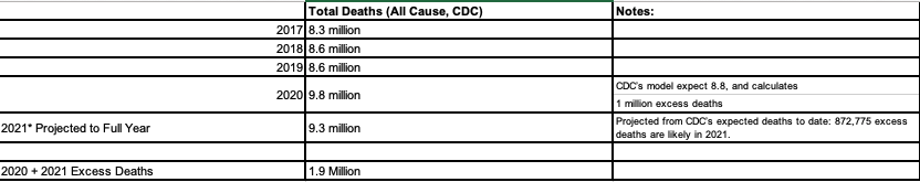
* 2021 deaths reported through the week ending September 18 is 6,991,940, which is 75% of the year. Dividing by deaths reported by .75 = 9,322,587. Same approach is applied to expected deaths to arrive at excess deaths for fully year.
The Economist estimates that the US undercounts COVID-19 deaths by about 26%. As of the week ending Sept 18th, the most recent week of CDC data, total excess deaths are 49% higher than the reported COVID-19 deaths. Part of this number is an undercount of COVID-19 deaths and part of it is collateral damage from the pandemic. Using the total count of excess mortality, some states have been more successful at saving lives than others.
A State-by-State View
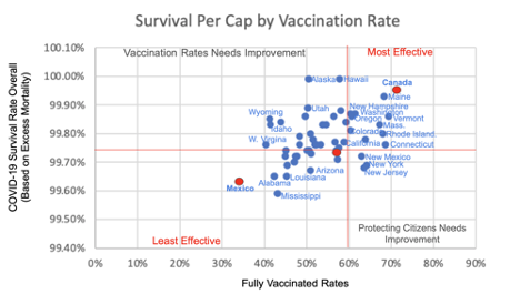
The Most Effective States (Chart 6) are mostly New England. These states were hit hard early in the pandemic and therefore had more overall deaths. But, these states have been more successful than many other states at getting its population vaccinated and containing the virus since the initial wave. Masking has also played an important role. Data I’ve used from Carnegie Mellon’s Delphi Group provides insight on State and County mask use. Washington State is noteworthy because they were first to detect cases and were highly effective in keeping their population alive. Washington has also been effective at achieving vaccination rates above the national average. However, many states, these states included, are undercounting COVID-19 deaths.
My calculation uses the excess mortality rate found in the Economist analysis and analyzes the raw data for each state. Vermont has the largest discrepancy, with excess mortality rates 3.36 times higher than reported deaths. I am using the excess death calculation as the basis for calculating survival rates. Other states with significant undercounts include Oregon, Washington, South Carolina, Texas, Tennessee, and Nebraska. A few states have negative excess mortality. Hawaii, where tourist activity is down significantly, experienced fewer deaths than in pre-covid times.
The dozen States doing the best on the combination of keeping its population alive and getting them fully vaccinated are as follows:
Rank:
Vermont
Connecticut
Maine
Rhode Island
Massachusetts
Maryland
New Jersey
New York
New Mexico
New Hampshire
Oregon
Washington
The dozen states doing the worst are (in order of bad to less bad):
Rank:
50. West Virginia
49. Idaho
48. Wyoming
47. Alabama
46. Mississippi
45. North Dakota
44. Louisiana
43. Arkansas
42. Tennessee
41. Georgia
40. South Carolina
39. Oklahoma
West Virginia made a strong initial effort at vaccinations, but as vaccinations become politicized, lost momentum in the state, and West Virginia is now the least vaccinated state in the country.
The full list and data that produce the scores is available from this google sheet.
Chart 6: US State Survival Rate & Vaccination Rate
(A google sheet is available for the full data set and rankings)
Even the most effective States in the US are having a rough end to September. Unlike Europe, where half the countries have fewer deaths than a bad year of the Flu, US states are faring far worse. In the last week of September, not a single US state was below the level of a bad year of the Flu. Not one.
The scale of deaths in the US is significantly worse. Compare the scale on Chart 7 for the US vs Chart 1 for Europe. The scale is 2x higher for US States compared to Europe. I suspected the US was worse, but by this magnitude? That was unnerving.
COVID-19 reported deaths per million for week Sept 21 to Sept 28
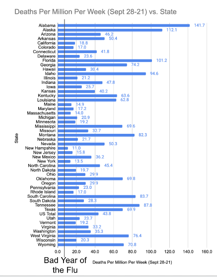
To understand how truly bad this wave is in certain US States, consider that the peak in deaths per million per week before this wave was back on January 15, 2021 when nearly everyone was unvaccinated. At the peak of that Winter wave, 71 people per million per week died. In the last week of September, ten US States were over a peak of 71 deaths per million per week (Alabama, Alaska, Florida, Georgia, Idaho, Montana, South Carolina, Tennessee, West Virginia and Wyoming). Only one European country was over that peak level.
What’s more, the deaths per million per week shown in Chart 7 (above) are among everyone -- not just unvaccinated. A like-for-like comparison to the last wave would look at deaths per million per week among unvaccinated. Chart 8 (below) does just that. This peak in deaths per week is 101.4 -- more than 40% higher among unvaccinated this wave compared to last wave.
Chart 8: Deaths per million per week among unvaccinated, vaccinated, and total population
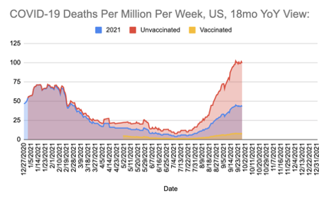
Another tragedy of Chart 8 is that for six weeks, from mid-June until the end of July, the US overall COVID-19 deaths was below the 7 per million per week of a bad year of the Flu.
The pandemic could have been over.
Based on the US’s early access to vaccine supply, the US should already be out of the pandemic. As discussed in Part 1 of last month’s analysis of cases from February through June, infections spread because the unvaccinated went unmasked. While the unvaccinated in Europe were seeking out vaccinations, the unvaccinated in the US were mostly going in a different direction. Based on my Vaccination Hesitancy Analysis, rates barely budged in the most conservative counties and states. As discussed in Part 2 of last month’s update, there are two sizable segments of unvaccinated. Children under 12 under, which are currently ineligible represent 15% of the total US population. And, the largest segment at 16% of the total US population, white conservatives. It is the later group that is largely responsible for eye watering numbers of deaths in this wave.
The peak in deaths among unvaccinated at more than 40% higher than the previous wave is bad enough, but the national average disguises how badly many states are doing. Chart 9 shows deaths per million per week among the unvaccinated by state.
In some states, deaths per million per week are over 200. Keep in mind, the #1 and # 2 killers in the US are heart disease and Cancer, which kill at a rate of 38 and 35 per million per week. 235 per million of the unvaccinated died last week in Florida. Florida is one of 17 states that banned mask or vaccine mandates. Is it reasonable to be appalled by the poor governance leading to more than 80,000 deaths over the past two months? After engaging the unvaccinated through community discussions, I forecasted it would be bad, but did not expect it to be this bad.
Chart 9: Deaths per million per week among unvaccinated, by State
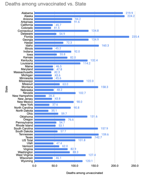
Note: Briggs Analysis, based on a conservative 10x ratio of deaths among unvaccinated compared to vaccinated. CDC data shows greater than 10x ratio.
Forecast
In the US, September has been the most deadly COVID month among the unvaccinated since the beginning of the pandemic. Fortunately, less than half of the US is unvaccinated, and those who are vaccinated have significant protection. I knew September would be bad, but no major forecast predicted September would be this bad.
Specifically, for September, in the US, I forecasted deaths would increase from August’s toll of 27,600 to 44,677 -- a substantial increase driven almost entirely by the unvaccinated. This was much higher than IHME’s forecast of 40,163 incremental deaths, and slightly lower than COVID Forecasting Hub, which estimated 46,714. The actual for the month was 57,469 - more than 15% higher than any forecast (15% is the threshold I use to classify a forecast as “within range”).
How did we all underestimate September’s death toll? Since deaths had increased from 8,563 in July, to 27,600 in August, I expected the message would get through to the unvaccinated to adjust behaviors to protect themselves and their loved ones from COVID-19. That’s what happened in previous waves, and I used prior response patterns to forecast this wave. But the people that are unvaccinated this wave are different than those unvaccinated last year. As it turned out, every major forecaster significantly underestimated the unvaccinated unwillingness to internalize the reality of hospitalizations, deaths and the role of vaccinations, masks and social distancing in preventing hospitalizations and deaths.
If one is looking for silver-linings, here are a few:
1) Vaccines provide significant protection from deaths and hospitalizations. By my calculations, vaccines have averted 759,254 deaths in the US, reducing the negative financial impact of the pandemic by approximately $6.6 Trillion.
2) Among the unvaccinated, my model suggests we may be at peak, or nearing peak in most states. My overall forecast expected the unvaccinated to peak at 100 deaths per million per week by mid October, but we hit that level last week. Considering the even higher levels of deaths per million among unvaccinated in certain states, I expect the signal of hospitalizations and deaths to get through to more of the unvaccinated - or perhaps to the vaccinated will pass policies requiring vaccination or testing.
3) Because of vaccination over and above the infection recovery, it is highly likely that the pandemic will not carry into 2022. Even if reckless behavior continues among the unvaccinated, there are only so many people left to infect. As I present my forecast for October through the end of the year, consider there are seven states past the 85% herd immunity threshold based on my calculation of combined vaccinations and infection-recovery immunity. Higher than average vaccinations propelled 71% (5 of 7) to these states to herd-immunity levels. Several other states are approaching these herd-immunity levels, again, mostly propelled by vaccinations. More employers are requiring vaccinations, and expansion to 5 to 11 years old’s is expected to be approved soon.
On the other hand, there are 17 states with bans on mandates for masks or vaccines (or both), as I reported in last month’s update. Not a single one of these states is above the 85% herd immunity level based on their reported COVID-19 deaths. It is unlikely vaccinations will increase significantly in these states. Deaths and hospitalizations, at great cost to society and to the families, will be the path out of the pandemic for most of these states. My advice, steer clear of these states if you can.
In my work with Brown University, we’ve developed a risk score to help you navigate which states and counties have higher levels of infections and lower levels of cumulative immunity, vaccinations, mask use and testing. A downloadable table is available from Brown University’s www.GlobalEpidemics.org. We hope to add a map UI soon.
Chart 10 shows my forecast peaking in early October and following a declining rate over the next six weeks. My model forecasts that Thanksgiving will result in new infections as it did in 2020 (the blue line in the chart). I would therefore suggest being cautious this year for the Holidays. This is a pandemic of the unvaccinated, though we all suffer the consequences of an enduring pandemic at some level. The yellow line shows the deaths per million among the unvaccinated. The red line is the national total. The blue line is 2020, as a reference.
Chart 10: Forecast deaths per million among vaccinated and overall
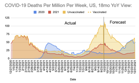
Ultimately, my forecast for 2021 remains about the same as last month -- we will end the year slightly above my worst-case scenario for the year, with about 790,793 deaths because the overall herd immunity levels will be crossed in the majority of states after Thanksgiving infections. We expect deaths to be lower in October, with another 44,581 deaths, almost all among unvaccinated. This is a decrease compared to September. My forecast for October brings the total deaths to just under 130,000 in the trailing three months since August 1.
TABLE: Forecast of reported deaths by month with counts by vaccinated & unvaccinated
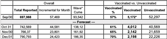
* Wave Cume from July 1. Forecast rate of Vaccine Breakthrough Deaths of 91% in my Model is higher than rates reported by CDC. Therefore, these figures for Fully Vaccinated Deaths could be more than 2x higher than actuals.
I was overly optimistic last month that the unvaccinated would change behaviors to protect themselves and their loved ones. Will they? Some I have engaged tell me they believe the COVID numbers are exaggerated, and their risk is low. Increasingly, the odds that an unvaccinated person knows another unvaccinated person that was hospitalized or died is increasing. This may turn the tide.
I’ll be the first to admit that I do not understand the unvaccinated psychology. Why have so many unvaccinated people died in the last two months? Was it a lack of comprehension of risk -- which is three times higher than the deadliest diseases, cancer and heart disease? Was it misinformation that told them the official statistics are exaggerated? (They’re not - they are undercounted). How does one become so upside down on the basic scientific facts of masking, better ventilation and social distancing as ways to prevent spreading infection? Is it just me, or does there seem to be more cohesion and forcefulness among the anti-mask, anti-vax cohort than the majority that are vaccinated and wear a mask? If so, why?
Are the unvaccinated beginning to question the (mis)information they have received about vaccinations and masks? Is there hope of reaching, informing and persuading the unvaccinated? Or should policy plans start with the premise that a minority of Americans will not take the actions to end the pandemic of their own accord? The majority, armed with science, will need to take actions to solve the challenges.
The good news is the pandemic is at an end for the vaccinated. Many countries in Europe have (or will have this month) sufficient vaccination and infection immunity to declare an end to the pandemic, provided they keep their contact tracing and testing infrastructure in place to address localized outbreaks.
Localized outbreaks are all but guaranteed to occur, as pockets of less vaccinated communities can and will get SARS-CoV-2. The risk, as we approach the end of the year and Delta has run its course, is that there is room for a variant to spread that is successful at reinfecting those that have recovered or breaking through immunity from vaccination. SARS-CoV-2 mutates all the time. It is possible for a variant to emerge that can infect those with immunity. The question is whether such a variant will produce mild outcomes among those with immunity, as has been observed with Delta, or severe outcomes - which sparks another wave of deaths. Personally, I have been keeping an eye on Manaus, Brazil since January of this year because the variant was discovered to have a high rate of reinfection. A reason to maintain testing and sewage surveillance is to respond early to such a possible plot twist to the end of the pandemic.
An endemic phase would be characterized by the variants continuing to spread but producing more mild outcomes. This is what my forecast assumes. Not in my forecast, but a possibility is that a variant produces a new wave of deaths similar to what we’ve experienced thus far. Those countries and states with effective contract tracing, and populations that recognize the value of vaccinations and non-pharmaceutical interventions (NPIs) like social distancing and masking, will be able to respond quickly and keep the virus in check. The least effective countries and states will add to the death toll. We’ve seen the movie before, haven’t we? We know the plot by now.
The sequel to this movie are the other global challenges, including climate change and the rise of anti-democratic strategies to undermine elections. Perhaps there are lessons from combating COVID we can apply going forward.
Rex Briggs
Consultant and Author at Marketing EvolutionRex Briggs was named one of the dozen “best and brightest” in media and technology by Adweek, and one of the people to “watch and learn from” according to Brandweek. He has been honored with the Atticus Award for his work in direct marketing, the Tenagra Award for outstanding contribution to branding and ESOMAR’s Fernanda Monti Award for his work in CRM. Rex has also won international research awards for his work in understanding website effectiveness and online advertising. His work in understanding the effects of advertising in television, magazine and online was nominated for the prestigious John and Mary Goodyear Award for best international research. Rex was the first director of research for the Internet Advertising Bureau (IAB), and pioneered attribution analytics. His research has been translated into a half-dozen languages and he has taught at leading universities around the world.
Rex is the best-selling author of “SIRFs-Up – How Algorithms and Software are Changing the Face of Marketing.” The book tells the story of how brands can better optimize advertising spend with equations known as “Spend to Impact Response Functions” (SIRFs) and how they will become an integral tool for marketers of every size and vertical for allocating budgets and forecasting business results. Rex also is the best-selling author of “What Sticks: Why Most Advertising Fails and How to Guarantee Yours Succeeds.” The book draws learning from ROI measurement from 36 major marketers. The studies were designed by Marketing Evolution to track media expenditure in real time and offer solutions on how marketers can improve ad effectiveness. “What Sticks” was named the #1 marketing book by Advertising Age, and was featured on CNBC, Bloomberg, CNN, NPR and The Economist. Rex is an instructor for the Association of National Advertisers’ (ANA) School of Marketing, where he holds workshops on ROI measurement technologies and IMPACT Marketing.
Rex founded Marketing Evolution in 2000 and sold his interest in 2019. He is an independent consultant and author. Rex is known as one of the world’s leading experts in marketing ROI measurement and optimization technologies. His expertise derives from direct experience measuring and improving the performance of a wide range of marketing programs for more than 100 Fortune 500 marketers.