COVID-19 Omicron retrospective
My hope for our research community is that we will unlock new insights and analytics to make the world a safer and healthier place for us all.

Article series
COVID-19 impact
- Making healthy habits stick after COVID
- Shobservatory Research Chronicles: Lockdowndiaries
- Capturing early stage consumer feedback, post-COVID
- Evolution of physical space in retail and hospitality
- November 2021 COVID-19 forecast & commentary
- Ethical brands in pandemic times
- November 14 reforecast due to OSHA rule stay
- COVID-19 December 2021 forecast for the USA
- Omicron
- COVID-19 forecast in the USA
- COVID-19 update for the USA
- COVID-19 Omicron retrospective
- Crises and community
- Research that makes a difference
In December, as Omicron took over from Delta, it was clear it was more contagious, but, considering the 21-day lag from infection to death for COVID-19 thus far, we didn’t know how severe it would be. I developed three scenarios, a best, worst, and base case. By mid-January, I had assembled enough data from Europe, Canada and the US to conclude we were trending in the best-case scenario in terms of hospitalizations and deaths. I updated the forecast on January 18th for the quarter accordingly. The best case is still not great – I was forecasting 168,433 deaths in Q1 (compared to 35,000 deaths of Flu in a typical full year, the best case for COVID is still quite painful). As we are at the end of Q1, we can compare the forecast to the actual. We ended March with 159,129 deaths (a 5.8% difference - chart 1). Omicron was worse than Delta in terms of deaths. In Q4, Delta killed a reported 126,348 in the US while Omicron killed 159,129 – 25% more than Delta.
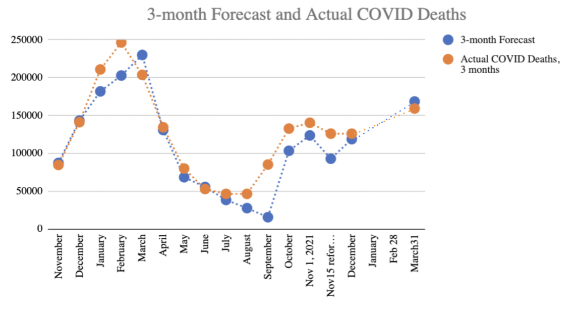 Chart 1: Three-month forecast of COVID-19 reported deaths in the US
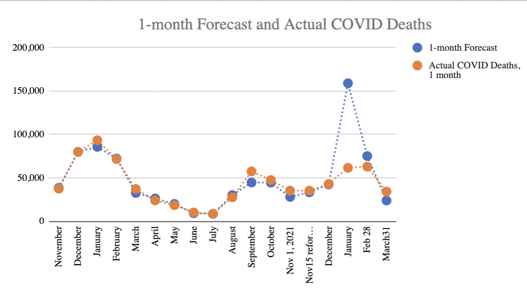
Omicron was much more difficult to forecast initially – from mid-December to mid-January, as cases climbed but the typical 21 day lag in infection to fatalities had not yet revealed the Case Fatality Rate, my initial estimate for January deaths proved far too high. By mid-January, it was clear we were on the “best case” trend line, which assumed Case Fatality Rate (CFR) for Omicron would be significantly lower than for Delta. The CFR trended down from 1.7% for Delta to as low as 0.33 by mid-February. For February and March one month forecasts, the projections were far more accurate (chart 2). The January forecast could have been more accurate had countries followed Israel’s lead in publishing weekly data by cohort.
Improving public data
The challenge in forecasting Omicron came down to data availability. For Delta, the data from Israel was excellent and timely. Israel provided weekly data of cases, hospitalisations and deaths by 10-year age cohorts by vaccination status. This was published on a publicly accessible website for analysts like me to evaluate. However, for Omicron, the countries that experienced it first (Denmark, UK, etc.) did not publish such data. Data was available to certain academics, which would then publish their analysis, but this introduced time lag and additional uncertainties as definitions of fully vaccinated were inconsistent across studies. Raw data would have made it easier for me to assemble consistent data for forecasting. The lack of data made it exceedingly difficult to evaluate the hospitalization and fatality rates early on in the wave. Based on aggregate data analysis, I was able to project lower hospitalization and fatality rates early on, in December, but the degree of uncertainty was substantially higher. I projected the Case Fatality Rate would trend down by about 40% – but might be offset by hospitals exceeding capacity, which they did during Delta. In the Delta wave, when hospitals exceeded capacity, death rates climbed as not all patients could get the care needed to survive COVID. For Omicron, while hospitalizations exceeded Delta’s peak, the fatality rate did not seem to climb. A study from Kaiser Southern California and UC Berkeley expected a 93% decline in Case Fatality Rate based on the cases they were observing early on in the pandemic. As it turned out, 21-day lagged CFR average in Q1 was down 41.4% compared to the 21-day CFR average in Q4. It is possible that the Kaiser/Berkeley study represents the true baseline CFR and the higher CFR across the US is due to full hospitals. Or it is possible their estimate was too low.
Climbing Case Fatality Rates
What is concerning at the moment is that the 21-day lagged Case Fatality Rate has been steadily climbing since hitting the nadir in mid-February (down 76% compared to the average for Q4). As of March 31, Case Fatality Rate was 1.6% which is actually higher than the Q4 average for Delta (and about the same as the Q3 CFR figure).
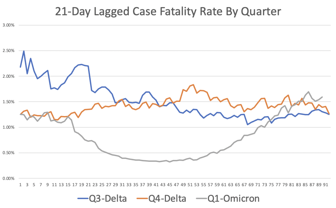 Chart 3: 21 day lagged Case Fatality Rate
Why is CFR climbing? It is possible as mask mandates ended, larger viral loads lead to more severe outcomes. It could be that vaccination protection is waning. It could be that the new sub-variant of Omicron is more deadly. Some of the variances in the Case Fatality Rate is a result of the denominator (cases reported). Cases reported are not a precise measurement of actual infections. The US (more so than Europe) undercounts cases due to less testing per capita. A good way to understand the degree the US is undercounting is to evaluate the positivity rate (as the positivity rate climbs, the degree of undercounting infections increases). Chart 4 shows the positivity rate trend, as reported by COVID ActNow.
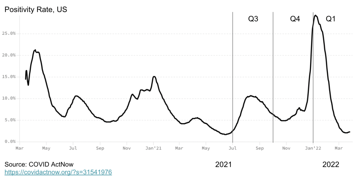 Chart 4: Positivity rate in the US
Deaths are also undercounted. Analysis of excess mortality published in my previous analysis reports the trends in the degree of undercounting deaths. The Economist has published a global view of the undercount, and their figures are well aligned with the figures I’ve observed. Unfortunately, for the Omicron wave, it is unclear at the moment the degree of undercounting. In a few months, when excess mortality data is available, it may be that there were more deaths in Q1 that were likely COVID than reported.[1] At that time, we will have a more definitive understanding of Omicron’s ultimate impact. My interpretation of the data is that the fatality rate did in fact dip with Omicron as people became more cautious in the first month of Omicron by masking, testing and social distancing. But, as these Non-Pharmaceutical Interventions (NPIs) diminished, particularly among the older population, which is more susceptible to dying of COVID, so too did their benefit in terms of a lower fatality rate.
I don’t think the climbing CFR rate is a result of different level of undercounting cases in Q4 versus Q1 – though a lot of cases are missing in December and January, as indicated by the very high positivity rates. Missing cases average out to about the same level across Q4 and Q1. It does appear that the Case Fatality Rate for Omicron is trending to a rate similar to Delta. So, why are deaths down in Q1?
The simple answer is vaccinations. On the positive side, with vaccinations, deaths had trended down compared to the prior year, before vaccinations were broadly distributed. In Q1 2021, 205,619 reported COVID-19 deaths occurred vs 159,129 reported this quarter –a 23% decline. Among vaccinated, the death rate is substantially less. The CDC data on deaths among vaccinated and unvaccinated lag, and the data doesn’t distinguish between boosted and unboosted, but even so, as of 29 January, vaccinated were one-tenth as likely to die of COVID-19 compared to unvaccinated. Factoring the differential in the percent of vaccinated (66%) and unvaccinated (34%), the majority of all deaths are among unvaccinated. Vaccination and boosters helped keep Omicron deaths to a lower level in Q1 compared to Q4, even as total cases climbed.
Early in the pandemic, I analysed data from China based on the date of birth and concluded that 80% of all deaths were among those 65 and older. A debate ensued about whether people were dying of COVID versus with COVID. Research from Scotland and UK found that COVID-19 deprived people of about 12 years of life, on average. Excess mortality rates further underscored that COVID had raised the death toll. People were dying of COVID, not with COVID, at alarming rates. That said, considering those vaccinated die on average more than a decade older than those not vaccinated, it would be worthwhile to revisit if those fully vaccinated are dying with COVID or from COVID. I suspect that they are dying of COVID, but the differential life expectancy is closer to 3 years than the 12 years found in prior research before there were vaccines available. In Israel, the data is published weekly by age cohort, making this analysis possible, but in the US, the data is not published by age cohort and vaccination status in a timely manner.
The conclusion is that vaccines have significantly reduced mortality and extended life expectancy for those that are vaccinated. However, with one in three Americans unvaccinated, we should expect to see elevated death rates for the foreseeable future. Early on in my forecasting, prior to Delta, I could project a day when the death rate was about as low as the seasonal flu – in other words, around 3 per million per week. We reduced COVID to that level before Delta. As the research we conducted in Washoe, Nevada showed, Delta was most often spread by those unvaccinated (twice as likely to become infected and twice as likely to infect others). The insight is that as one variant declines, the dynamics are right for another variant to take its place. This pattern continued with Omicron. With such a large unvaccinated population, we should expect additional waves beyond Omicron.
The hope is that vaccinations and infection recovery produce additional protection reducing the severity of each future wave. More than a year ago, I accurately predicted that we would not see a wave of deaths as large as Q1 2021 because vaccinations would reduce that possibility. That said, COVID most likely crossed over from the animal kingdom. With many documented species now infected with COVID, there is a reservoir of infections that can cross back over again with significant mutations. Therefore, it is wise to maintain sewage surveillance and the capacity to respond with interventions when necessary. Interventions such as vaccinations and masking have become political. The consequence, based on my most recent analysis, is a death rate of 3:1 for Republicans to Democrats. While the difference in voter turnout from one election cycle to the next is more significant than the increased death rate among Republicans due to COVID, I would hope it would lead some Republican elected officials to re-evaluate their policies. As documented in prior analysis, those states that banned vaccination and masking requirements for students and faculty experienced significantly more deaths per capita.
Recommendations
As this will be my last COVID-19 analysis in this series, I wanted to share how I have been personally navigating my choices based on my calculations of risk in case it is helpful. First, I am fully vaccinated and boosted and will get my 4th booster by the time this article is published. My research and the research of others found that vaccinations have proven to be effective at reducing deaths, hospitalisations, infections and the spread of infections.
In terms of social distancing, I was on the more cautious side of the spectrum. Though, I have attended family gatherings and will selectively do so in the future. When my father passed away of cancer last month, I attended his funeral in person along with about 60 other friends and family. That was the largest gathering I have attended since COVID emerged. I tested prior to attending so that I would not be a vector spreading SARS-CoV-2, and I tested four days after to check to ensure I had not become infected so that I would not spread it back into my community at home. When travelling, I wore a mask, but with extended family and friends, I did not. I admit to being influenced by the norms of the gathering. I brought a mask and would have put it on if that was the norm for the event.
My calculation of risk was based on the knowledge that about 1 in 150 Americans at the time was infected with COVID (whether they knew it or not). You can make this calculation by taking the US population of 328 million and dividing it by the active infections. Active infections can be approximated easily by multiplying the cases reported in the past seven days by 10. This accounts for the average duration of infectiousness and the US undercount. In Europe, multiply by five as the undercount of COVID is much less due to more testing (you can see how much less by comparing positivity rates).
I kept in mind that the dynamics of the spread are mostly airborne and depend in part on the duration with a person and the activity. Quietly sitting and listening to my mother deliver the eulogy had a very low risk of transmission compared to the face-to-face I also engaged in. I managed my time with family members and spent more time with those I knew were vaccinated because their risk of infection is lower, and their risk of transmitting to others should they be infected is also lower. I tested again four days after returning home from the funeral so that I would not infect others in my community if I was infected. Catching COVID early on allows for a range of treatments that minimise severe outcomes.
I will be presenting at a conference in May, sharing my research on the effectiveness of Ad Council communications in fighting misinformation and encouraging vaccinations. I will use a home test before leaving for the event. I will do a quick check on the cases and risks. I will wear a mask during my travels and wash my hands. I will test again four days after the event. For me, these adjustments are neither time consuming nor burdensome actions to take, considering that about a million people have died in the past two years of COVID. I suspect many reading this article make similar risk assessments and take similar precautions.
Is there a cure for misinformation?
While I got a lot of things right over the past two years of forecasting COVID-19, what I got wrong was my optimistic view that we could push down the level of deaths from COVID-19 to that of a bad year of the Flu. A typical year of Influenza/Pneumonia claims about 35,000 lives, and a bad year claims 65,000. In the US, we got down to that level briefly in May 2021. Remarkably, for fully vaccinated, it has remained around this level for a full year. But so-called herd immunity did not materialise for this disease to protect those unvaccinated. I don’t think most of those unvaccinated realise how high the death rate is on a per capita basis. Nor do I think they recognise how low COVID deaths and hospitalisations are among the most highly vaccinated communities, such as college communities with over 95% vaccination rate. Many colleges, my analysis found, had universal testing in January, after the winter break. The data revealed that cases and severe outcomes were less than half the levels of their surrounding counties once adjusting for differential positivity rates. Moreover, the rates of severe outcomes were far lower among faculty than in a bad year of the flu. But few countries overall achieved this level of near-universal vaccination, and therefore, the benefit of vaccination accrues mostly to those vaccinated.
The good news, the majority of people in the US are vaccinated. For those vaccinated, severe outcomes such as extended hospitalisation or death remains a rare outcome, similar to the risk of dying of the flu. For the unvaccinated, the death and hospitalisation rate is well above a bad year of the flu. For unvaccinated, COVID has been the #1 killer (more than cancer and heart disease) for the past year. I don’t see that changing because every time one variant wanes and cases drop, Americans reduce masking and social distancing, giving room for a new variant to expand – especially among the unvaccinated. My analysis found that in both Delta and Omicron, unvaccinated accounted for a majority of the infections, hospitalisations and deaths – even though unvaccinated are a minority of the population. Unvaccinated were twice as likely to transmit to others and were significantly more likely (based on CDC data) to be hospitalised and die of COVID-19. The fact is that one-third of the US decided against vaccination in spite of the clear health evidence. The question is, why? Why would someone take such a risk?
The first observation is the value of a college education. Those with more education don’t take the risk to the same degree as those with less formal education. Vaccination rates have more than a 0.7 correlation with educational achievement. If we use COVID as a case analysis of misinformation and consider that information leads to a decision, in the midst of a deadly pandemic, to mask and vaccinate to protect oneself and others, we find that completing a college education (completing an advanced degree is better than completing an undergraduate degree) is associated with better outcomes. More college education is associated with even better masking and vaccination behaviour and, therefore, even better health outcomes. It might be worth analysing whether science-oriented degrees are more associated with vaccination and masking than non-scientific degrees. Or perhaps degrees emphasising critical thinking and analysis may perform better. It may be that we need to have more emphasis on these skills earlier in the education system. It is also likely true that we need to increase investment in higher education. Affordability is an issue in the US. As Pewresearch.org reported, there is also a concerning trend among males, where fewer are attending and completing a university education. If we were to predict who is and isn’t vaccinated in my extended family, a college degree is a pretty good single variable to start with.
Education appears to have a major influence, but so too does the media we consume. Predict which one is unvaccinated among two college graduates: one watching FOX News regularly or the one not watching FOX News. If you guessed the unvaccinated is the one watching FOX News, you’d be right more than two-thirds of the time.
The information the unvaccinated consume in conservative outlets such as FOX News downplayed the risk of COVID. I recall visiting Idaho, among the reddest of red states, to see my father before his death and turning on the local radio stations. I landed on a country music song, which ended with a brief new break. The syndicated news feed announced the death of an evangelical media owner, Marcus Lamb, at 64 and praised his media ministry in a brief eulogy. I was familiar with the death because he was anti-vax and used his media to advance that position. He died of COVID. I was shocked when the news segment reported his death without mentioning that he died of COVID. The Christian Country Radio station syndicated their news from FOX, and this relevant piece of information was absent from the reporting. This anecdote corresponds with a recently completed study examining how attitudes are shaped by the media we consume.
Can we counteract misinformation? Maybe. More education can certainly help in the long run. In the short run, new research suggests that changing the media diet can show a change in attitudes in a 30-day period. I’ve spent most of my career scientifically studying the influence of communications (advertising, social and PR) on attitudes and behaviours. Self-stated surveys show that most people don’t believe their attitudes and behaviours are influenced by the media and messages we consume, but experiment after experiment proves it is. Like raindrops falling on a mountain over time, Media carves a deep canyon. The media we consume shapes who we are. Even more, challenging are AI-powered newsfeeds that assemble echo chambers of perspective. What is less clear is the solution to misinformation. My hope for our research community is that we will unlock new insights and analytics to make the world a safer and healthier place for us all.
[1] In March 2022, Massachusetts reclassified COVID deaths downward, changing their official count by 3,770 and exacerbating their undercount in the future – despite excess mortality showing they, like all US States, were undercounting. For consistency through the end of Q1, I added back the 3,770 deaths in MA to the total US COVID-19 death toll.
Rex Briggs
Consultant and Author at Marketing EvolutionRex Briggs was named one of the dozen “best and brightest” in media and technology by Adweek, and one of the people to “watch and learn from” according to Brandweek. He has been honored with the Atticus Award for his work in direct marketing, the Tenagra Award for outstanding contribution to branding and ESOMAR’s Fernanda Monti Award for his work in CRM. Rex has also won international research awards for his work in understanding website effectiveness and online advertising. His work in understanding the effects of advertising in television, magazine and online was nominated for the prestigious John and Mary Goodyear Award for best international research. Rex was the first director of research for the Internet Advertising Bureau (IAB), and pioneered attribution analytics. His research has been translated into a half-dozen languages and he has taught at leading universities around the world.
Rex is the best-selling author of “SIRFs-Up – How Algorithms and Software are Changing the Face of Marketing.” The book tells the story of how brands can better optimize advertising spend with equations known as “Spend to Impact Response Functions” (SIRFs) and how they will become an integral tool for marketers of every size and vertical for allocating budgets and forecasting business results. Rex also is the best-selling author of “What Sticks: Why Most Advertising Fails and How to Guarantee Yours Succeeds.” The book draws learning from ROI measurement from 36 major marketers. The studies were designed by Marketing Evolution to track media expenditure in real time and offer solutions on how marketers can improve ad effectiveness. “What Sticks” was named the #1 marketing book by Advertising Age, and was featured on CNBC, Bloomberg, CNN, NPR and The Economist. Rex is an instructor for the Association of National Advertisers’ (ANA) School of Marketing, where he holds workshops on ROI measurement technologies and IMPACT Marketing.
Rex founded Marketing Evolution in 2000 and sold his interest in 2019. He is an independent consultant and author. Rex is known as one of the world’s leading experts in marketing ROI measurement and optimization technologies. His expertise derives from direct experience measuring and improving the performance of a wide range of marketing programs for more than 100 Fortune 500 marketers.
Article series
COVID-19 impact
- Making healthy habits stick after COVID
- Shobservatory Research Chronicles: Lockdowndiaries
- Capturing early stage consumer feedback, post-COVID
- Evolution of physical space in retail and hospitality
- November 2021 COVID-19 forecast & commentary
- Ethical brands in pandemic times
- November 14 reforecast due to OSHA rule stay
- COVID-19 December 2021 forecast for the USA
- Omicron
- COVID-19 forecast in the USA
- COVID-19 update for the USA
- COVID-19 Omicron retrospective
- Crises and community
- Research that makes a difference