November 2021 COVID-19 forecast & commentary
This analysis examines why the US prolonged the Pandemic and the implications for the future
Article series
COVID-19 impact
- Making healthy habits stick after COVID
- Shobservatory Research Chronicles: Lockdowndiaries
- Capturing early stage consumer feedback, post-COVID
- Evolution of physical space in retail and hospitality
- November 2021 COVID-19 forecast & commentary
- Ethical brands in pandemic times
- November 14 reforecast due to OSHA rule stay
- COVID-19 December 2021 forecast for the USA
- Omicron
- COVID-19 forecast in the USA
- COVID-19 update for the USA
- COVID-19 Omicron retrospective
- Crises and community
- Research that makes a difference
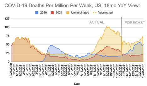
A year ago, in November 2020, with a line of sight to the roll-out of vaccinations, I generated the Briggs-3 Model to forecast the end of the pandemic and to illuminate the key drivers of the trends in COVID-19 deaths. The model included a forecast for vaccination rates and COVID-19 deaths. It marked the end of the pandemic as the point when COVID-19 deaths per million per week dropped below the level of a bad year of the Flu (which is about 7 this time of year).
The model expected Europe to hit this level at the end of Q3 (which it did). In the US, with its better supply of vaccinations and a higher level of immunity from infection recovery, the model expected the US to hit this level at the beginning of Q3 (which it did). However, shortly thereafter, the US broke from this forecast and cases, and deaths began to rise again. This analysis examines why the US prolonged the pandemic and the implications for the future. But first, a quick review of the forecast accuracy and expectations for the rest of 2021.
2021 forecast & accuracy
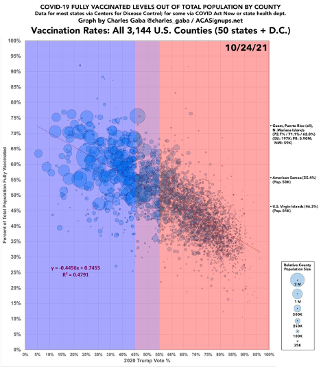
The model expects cases and deaths to increase in Europe and the US into the winter months, especially in areas where vaccination rates are lower. In most countries in Europe, we expect COVID-19 deaths to remain relatively low as the responsible implementation of proven strategies to curb the spread of SARS-CoV-2 are implemented when cases increase in a region. These strategies include expanded testing, tracing, social distancing and masking. In the US, on the other hand, we expect a politically polarized reaction to increased cases and deaths. In the Republican Red States and Red Counties, we expect far more deaths and hospitalizations than in the Democratic Blue States and Counties. This widening gap in the US is due mainly to differential vaccine & mask adoption. At the moment, roughly 1 in 65 people in the US are actively infected with COVID-19 and can infect others. Think about 1 in 65 the next time you are in a crowded location. For the US to end the pandemic, cases need to decrease to less than one-tenth the level they are at today. We have the means to lower the spread of COVID, but not always the will. The will to lower cases to this rate differs by region, and therefore most of the increase in COVID-19 deaths shown in the chart below will be concentrated in specific regions.
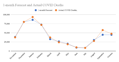
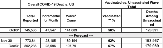
Overall, the Briggs-3 model has been among the most accurate. For the one-month forecast, we define it as accurate if it is within +/-15%. Briggs-3 has been accurate in 11 of the last 12 months (92% accuracy) for projecting COVID-19 deaths one month into the future. This compares favourably to well-known forecasts like IHME’s, which was accurate 42% of the time when counting incremental deaths for the month. For October, the model predicted 44,581 reported deaths in the US. The actual was 47,547, which means the Briggs-3 forecast was about 6% lower than the actual. IHME forecasted 35,944, which is 24% lower than the actual.
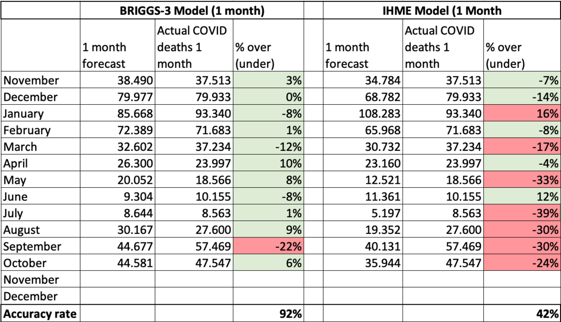
Note: I use IHME to benchmark and compare forecast performance. I use +/-15% of the incremental deaths for the month to define an accurate monthly forecast, and +/-20% for a three-month forecast. Compared to IHME, Briggs-3 performed 120% better on the one month forecast and 125% better on the three-month forecast. For a table of month-by-month forecast vs. actuals, see this google sheet here.
The Briggs-3 model was 100% accurate (+/- 20%) projecting COVID-19 deaths three months into the future, up until August, when the model expected the pandemic to be over in the US. However, the model underestimated how many people (nearly all unvaccinated) would become infected and die of COVID in August through October. The Pandemic of the Unvaccinated revealed new insights on human behavior which inform the forecast going forward.
The Briggs-3 model was designed to make it easy to understand the fundamental drivers that determine COVID-19 deaths. Specifically, the model focuses on: Infections, Infection Fatality and Immunity.
Immunity comes from 1) Vaccinations and 2) Infection Recoveries. It can be affected by variants that can break through immunity.
Infections and Infection Fatality Rates (IFR) are hard to measure directly because not everyone that becomes infected is tested. Part of what makes SARS-CoV-2 particularly dangerous is people can infect others during a pre-symptomatic phase, and some can infect others without ever becoming symptomatic. Still, we can measure trends in infections using confirmed cases and deaths and infer overall infection levels.
It is easier to measure Case Fatality Rates (CFR), which is the percent of confirmed cases that result in deaths. The model infers the overall infection rate based on reported deaths. The model uses confirmed cases to calculate active infections and immunity from infection recoveries. In general CFR and IFR should trend downward as treatments improve but can trend upward when hospitals become overwhelmed.
What the model makes clear is that controlling COVID-19 deaths is as simple as recognizing the gas and brake pedal. The brake pedal for COVID-19 deaths is vaccinations and non-pharmaceutical interventions (NPIs) that slow the spread of infections. The most important NPIs are the use of masks, social distancing, and testing. The gas pedal, accelerating COVID-19 deaths, is more human interactions without NPIs like masks and social distancing, particularly in populations with low vaccination rates, which are more likely to die if infected with SARS-CoV-2. Each person that becomes infected can spread COVID to others, and those with COVID die at a relatively predictable rate. Therefore, each person should aim not to become infected, and if infected, to take every precaution not to infect others. But, if people believe COVID-19 deaths are a hoax, and masks don’t work, and therefore do not modify their behaviors, they put themselves and others they come in contact with at risk.
To assess risk of becoming infected (and thereby potentially infecting others), one can consider the active infections in a given county. I estimate active infections in the US by taking cases reported this week (past 7 days) and multiplying by 10. This roughly accounts for the average amount of time a person is infectious and the likelihood we only catch one in three to four infections with our current testing levels. Taking the total US population of 328 million and dividing by the active infection estimate provides a roughly 1 in 65 estimate for the last week of October, 2021. I would not, for example, join a choir competition right now. In June, the US had cases as low as about 8,000 per week (about 1 in 500 actively infected) but with the removal of masks and insufficient immunity, the fourth wave was seeded. Immunity is higher now, due to more vaccinations and infection recoveries, but not high enough to prevent the spread. I would aim for daily cases of less than 5,000 before discarding masks and social distancing. In the last week of October, the case count was over 70,000. While cases are trending downward, we have a long way to go.
The point of designing my model based on these simple drivers was to remove the black box nature of Machine Learning and statistical models to make it obvious what produces COVID-19 deaths, where risk exists, and the key metrics to end the pandemic. I suspect that everyone reading this analysis feels I am restating the obvious about assessing risk and taking precautions to avoid spreading COVID. The question is, “if it is so obvious, why did the US descend back into the pandemic?”
Why did the US descend back into the pandemic?
The US descended back into the pandemic based on the behavior of the unvaccinated. To blame the recent wave of infections, hospitalizations and deaths on Delta is a mistake. Canada didn’t suffer the same fate, nor did most of Europe, even though Delta represents the vast majority of all cases in both regions. No. The US isn’t suffering from Delta. The US is suffering from the destructive behaviors and beliefs of the unvaccinated.
The destruction in the US amounts to over 140,000 incremental deaths (and counting) and about three quarters of a million hospitalizations. The deaths are among younger people, where vaccination rates are lower. This means more years of life lost. Earlier in the pandemic, when 80% of all deaths were among 65+, the years of life lost per person dying of COVID was about 12 to 13 years. In other words, if a person died of COVID-19 at 70, he or she probably would have lived to be 82 had COVID not taken their life. Now, with a larger proportion of younger people dying, years of life lost will likely double by the end of this year compared to earlier in the pandemic.
At the same time, the US should have exited the pandemic months ago, with an economy pivoting back toward services and inflation pressures easing. The pandemic caused Americans to change purchasing patterns and purchase more goods and fewer services. This creates supply chain challenges. Why would anyone who cares about the US economy want to prolong the elevated purchase of goods over services, increase inflationary pressures and transfer more wealth to China (The #1 source of goods for the US)? At a time when Americans should be done with the pandemic, and planning a family holiday, instead families are bidding prices up to buy goods that are stuck in containers that may or may not arrive in time for Christmas. Why is the US still in the throes of the pandemic?
It is important to document how the US prolonged the pandemic by six months, causing destruction to the economy and to lives, so that we have clarity on what we might do to avoid similar destruction in the future. We can gain insight by studying the difference in positive tests among vaccinated and unvaccinated from February 2021 to the end of June 2021. Working with Brown University, Harvard, the Nevada State Public Health Lab and Washoe County Health District, we tracked every case over these months. You can read the MedRx write-up here. To quote my August Summary of this data:
Unvaccinated are responsible for spreading Delta. In partnership with Brown University School of Public Health, Harvard, The Nevada State Public Health Lab and Washoe County Health District, I studied every case of COVID in Washoe County over a six-month period (from February 1 to July 29th). What we found was 94.5% of cases, 96.0% of hospitalizations and 100% of deaths were among the unvaccinated. The population we studied mirrored the US national average, with 51% of the population in this county “Fully Vaccinated” by the end of the study period. The ratio of confirmed cases among Fully Vaccinated was 1 in 709, while the ratio for unvaccinated was 1 in 40. The implication of this disparity between unvaccinated and vaccinated is that If everyone was vaccinated, the R-naught would have been well below 1, and the virus would have burned itself out.
The Lancet recently published findings that showed those unvaccinated were 52% more likely to spread the virus compared to someone that is vaccinated and experiences a breakthrough infection. The CDC reports that those unvaccinated are 6.1x more likely to test positive and 11.3x more likely to die of COVID-19.
In sum, but for the behavior of the unvaccinated in the US, we would be out of the pandemic. Global supply chains would have had a chance to recover as spending would have shifted back toward services like vacations, theatres, etc. The trade deficit with China would have narrowed, rather than expanded. Inflation would be less. Medical screenings would be returning to normal. In other words, we’d be benefiting from the end of the pandemic. In terms of COVID-19 deaths per million per week, the US would be looking a lot more like Canada or the major economies of Europe. In the last week of October, France had three deaths per million. Canada had four. Germany seven. The US had twenty-four deaths per million -- 600% higher than our neighbours to the north. That’s not to say Europe and Canada will not experience rising COVID-19 deaths this fall and winter -- they will, per our forecast. But they won’t experience nearly the same level of deaths per million and economic destruction the US will experience.
Why is the US going in a very different direction from our friends in Canada and Europe? I’ve been modeling vaccination adoption since last year and generating a monthly vaccination analysis for Ad Council and other interested parties since January 2021. The model predicts vaccination rates at the county and state level by factoring COVID-19 deaths per capita, race, religion, politics, and several other potential factors. Over time, politics went from a non-issue to the #1 factor influencing incremental vaccinations. As a registered non-partisan, and a former registered Republican, I wish I didn’t have to bring politics into this analysis. But politics are so clearly the driving force leading to destruction of lives and the economy, it wouldn’t be intellectually honest not to report the findings.
This isn’t the first time that politics changed the trajectory of the pandemic. In September 2020, when Trump was denying the gravity of COVID and discouraging testing, mask wearing, social distancing as he held indoor rallies, portraying an image that COVID was a non-issue (even though he knew the deadly consequences based on January recording with Bob Woodward), I raised my projection of COVID-19 deaths for the end of 2020 from 300,000 to 350,000, even though the cases were flat to declining at that time. That forecast proved to be nearly exactly right -- the US crossed 350,000 on January 2nd.
Politics are once again leading to more deaths. I’ve been tracking vaccination rates by county, and the factors influencing vaccination since my report in May. Last month, the difference in vaccination growth rate between the counties where Trump won by a margin of 2:1 or more and counties where Biden won by a margin of 2:1 or more was 82%. 82% difference! In addition to my October report, here is another researcher’s chart and analysis of the significant political divide.
Why are vaccination rates so different? They weren’t that different at the start of vaccinations, when much less was known about their safety and efficacy. Back then, in December 2020 through March of 2021, more Republican leaning counties were vaccinated. One answer I’ve received to the question of why there is such a difference in vaccinations is that “there are unknowable longer-term effects of vaccinations, and some folks are more cautious with what they put into their body.”
OK, then why not mask up? Large scale studies led by Stanford show an 11% to 35% reduction in transmission (depending on age) from increased mask use in a community, and a small scale study published in Nature of coronavirus and mask wearing in the same room as an infected person for 30 minutes shows 30% to 40% transmission without a mask and zero transmission with a mask. A rational response to uncertainty about long-term effects of vaccination is to use other countermeasures, such as masking up, yet conservative counties show significantly lower mask use. Moreover, elected officials in several conservative states passed laws banning the mandates for masks, or vaccinations, or both. It may be more accurate to characterize the efforts as sabotage by those in the know, and civil disobedience (as FOX News has termed it within in their nearly continuous assault on vaccines (according to analysis by Media Matters), which only started after Trump was no longer President).
To quantify the deleterious effects of this political divide, there are 70.5 million Americans living in the 8 states with vaccine mandate bans. Had these states achieved the same vaccination rate as the average for the 10 most vaccinated states of 67% by the middle of October, 12.3 million more people would have been fully vaccinated in these states and 40,895 more people in these 8 states would not have lost their lives to COVID-19 this year. The US has a long history of states having the right to exercise their police power in times of pandemic, but I could find no instances in prior pandemics where states forbad the right to mandate vaccinations and other precautions. Nearly all the people dying of COVID-19 since vaccinations became available are unvaccinated. This wave (starting on July 1) has claimed a reported 141,089 lives, which is certainly an undercount.
While the vaccination formulation has not changed at all in the eight months since Republican leaning states led in vaccinations, the minds of conservatives, largely younger conservatives, have changed. Their vaccination rates stalled, and their death toll increased. Nearly 85% of those 65 and older have had two doses -- but most of this occurred before the intense politicization of the vaccine. A third dose, data published in The Lancet suggests, will be highly beneficial, but we are now seeing a political divide slow the adoption among Trump leaning elderly. Based on my analysis as of October 31, in the 10 states where Biden won by the widest margin, booster doses were 29% higher than in the 10 states where Trump won by the widest margin. Adjusting for the percentage of 65+ (conservatives skew older), there is a 26% higher booster dose take-up based on voting patterns. Is it worth increased scholarship to understand how conservatives have shifted from initially embracing the vaccine to rejecting it?
Having spent 25+ years measuring the effects of media and advertising, I find the research from University of Chicago that reported, early in the pandemic, that watching Hannity on FOX increased the likelihood of COVID-19 deaths. Hannity, consistent with Trump’s message, was downplaying the severity of COVID-19 and researchers found a statistically significantly higher rate of COVID-19 deaths among his viewers when compared to others that also watch FOX News. The study Media Matters, cited above, tracked how many days FOX undermined vaccinations. The research was generated by an impressive data set that converts video to text, allowing researchers to analyze sentiment around the keywords of COVID and Vaccine. More extreme networks like OAN and content on YouTube may also play a role in influencing the completely unnecessary 140,000+ deaths in this wave. In terms of a forecast, I expect this political divide in boosters to widen over time with the consequence that more deaths and hospitalizations will occur than otherwise might have.
It is more than the conservative counties and states that are suffering in this wave of COVID. The virus spread beyond those that consume certain media or have certain political leanings. It affects us all. The virus can break through vaccinations, and our service sector is far from recovering. We are all paying a great price in terms of hospitalizations and deaths and will continue to do so for more months to come. The anti-vax, anti-mask, anti-science rhetoric may appeal to the conservative, mostly rural and mostly less educated base, but will it ultimately backfire by activating the swing vote of independents that decide elections in battleground regions? Will these swing voters reject the conservative anti-mask, anti-vax stance that has prolonged the pandemic? Will the anti-mask, anti-vax approach backfire even in conservative states like Idaho, which Reuters reports has raging COVID and political leaders rejecting aid to keep the virus in check. So far, there is scant evidence that the swing vote connects this wave with 140,000+ deaths to the actions of the mostly conservative unvaccinated and unmasked. The press often describes the problem as “delta” rather than more accurately the problem of unvaccinated and unmasked.
A forecast for 2022 should start with a 2020 Presidential Election map. COVID-19 deaths per capita are still the most important factor influencing vaccinations, but many in conservative counties dismiss COVID-19 deaths as over-reported and caused by underlying conditions, or complete fabrication. However, that is not an accurate interpretation. Instead, COVID-19 deaths are underreported as I demonstrated in last month’s analysis -- and likely more under-reported in conservative counties based on my preliminary investigations. As a result of the behaviors of the unvaccinated, I have raised the forecast for November to an incremental 28,105 deaths, and December to 28,595. The total reported deaths at the end of 2021 are now forecast to exceed 800,000.
This wave, the wave of the unvaccinated, will approach 200,000 total deaths reported, with over 90% of them among the unvaccinated. It is a grim statement on the power of a relatively small minority to exert deadly force on the lives of others and the economy overall.
* Wave Cume from July 1 (604,446). Forecast rate of Vaccine Breakthrough Deaths of 91% in my Model is higher than rates reported by CDC. Figures for Fully Vaccinated Deaths could be more than 2x higher than actuals.
* Vaccinated % represents two does. For 65+, fully vaccinated includes booster dose. For calculating VBT deaths among 65+, definition of Fully Vaccinated includes booster dose. Deaths among partially vaccinated 65+ are expected as booster provides significant benefit.
Comparing Briggs-3 to IHME, IHME forecasts a bit lower with an incremental 25,112 deaths in November (11% lower) and 27,594 in December (4% lower).
Compared to Ahmerst’s Ensemble model, used by CDC, COVID Forecast Hub only projects 28 days out, and as of November 20, they forecast 22,265 incremental deaths since October 31, which is 8.4% higher than the Briggs-3 Forecast for the same date. I suspect COVID Forecast Hub is taking seasonality into account by using last year’s trends, but I believe last year was influenced by Presidential Election Year rallies and in-person voting, and therefore expect less of an increase this year.
I do expect the majority of the US to achieve a level of protection (call it Herd Immunity if you’d like) from the combination of vaccination and infection recoveries such that many areas will have a significantly lower risk. I’ve worked with Brown University to develop a risk map by county using the cumulative immunity calculation along with cases, testing and test positivity rates. Visit www.GlobalEpidemics.org for more details.
Brown University has also extended my model into 2022 and expanded the forecast from the national level to include state and county forecasts. As one would expect, the national forecast is likely to be more accurate than the state and county forecast due to the lack of data available for some counties and states. Finally, Brown University is making the entire dataset available for researchers. I believe we have assembled the most comprehensive dataset for the US states and counties. For a full dictionary of data available, visit the Global Epidemics website.
The data available through Brown University is one of the most expansive thus far and will be published at the national, state, and county levels. Included are key metrics for the COVID-19 pandemic (cases, deaths and estimated excess deaths, testing and positivity rates, hospitalizations, vaccinations, rates of adherence to public health policies, measures of jurisdictional policy stringency, population mobility, health capacity and vulnerability, vaccine confidence, and vaccination access) and jurisdictional demographics (income, inequality, education, political vote choice, religious adherents, population density, race/ethnicity distributions, and geography).
The data are aggregated across a multitude of sources, including the Centers for Disease Control, the Department of Health and Human Services, COVID Act Now, Our World in Data, the New York Times, Google, the US Census Bureau, the World Bank, the World Health Organization, the International Monetary Fund, Brown University, Oxford University, Harvard University, and Carnegie Mellon.
I’d like to thank Sameer Nair-Desai, a brilliant Research Assistant at Brown University. I’ve had the privilege of collaborating with Sameer to assemble this data set and migrate the Briggs-3 model from my laptop into a properly scaled architecture in R. Sameer has done a fabulous job extending the model to the state and county level and generating the risk scores. I’d also like to thank Stephanie Friedhoff, Professor of the Practice and Senior Director of Content & Strategy at Brown University School of Public Health and the Dean of Brown’s School of Public Health, Dr. Ashish Jha.
As I wrap up my pro bono work on COVID-19 and get back to my focus on marketing and business analytics, I plan to focus my final two monthly analyses on how we might quantify the impact of public health information and misinformation. It is important for us to understand how the US suffered from politicization while other democracies did not. Since my 2007 research on The Momentum Effect (see page 36+) was the first to quantify and explain how social media amplifies messages in ways far more powerful than television, and my work on AI-based personalization that dates back to my work at Wired in 1996, I feel a sense of responsibility to see if those in the marketing industry can help academics and policymakers. I bet we can assemble the data sets that reveal how pernicious information spreads, how perceptions are shaped over time, and how to create accountability so those generating and amplifying content have reasons to consider their impact. I’ve already seen some impressive work from the University of Chicago and Media Matters (cited above). There is a lot of work the research community can do to connect content and viewership to quantify the scope and impact of disinformation and misinformation. If you are interested in aiding in the effort, please contact me.
Rex Briggs
Consultant and Author at Marketing EvolutionRex Briggs was named one of the dozen “best and brightest” in media and technology by Adweek, and one of the people to “watch and learn from” according to Brandweek. He has been honored with the Atticus Award for his work in direct marketing, the Tenagra Award for outstanding contribution to branding and ESOMAR’s Fernanda Monti Award for his work in CRM. Rex has also won international research awards for his work in understanding website effectiveness and online advertising. His work in understanding the effects of advertising in television, magazine and online was nominated for the prestigious John and Mary Goodyear Award for best international research. Rex was the first director of research for the Internet Advertising Bureau (IAB), and pioneered attribution analytics. His research has been translated into a half-dozen languages and he has taught at leading universities around the world.
Rex is the best-selling author of “SIRFs-Up – How Algorithms and Software are Changing the Face of Marketing.” The book tells the story of how brands can better optimize advertising spend with equations known as “Spend to Impact Response Functions” (SIRFs) and how they will become an integral tool for marketers of every size and vertical for allocating budgets and forecasting business results. Rex also is the best-selling author of “What Sticks: Why Most Advertising Fails and How to Guarantee Yours Succeeds.” The book draws learning from ROI measurement from 36 major marketers. The studies were designed by Marketing Evolution to track media expenditure in real time and offer solutions on how marketers can improve ad effectiveness. “What Sticks” was named the #1 marketing book by Advertising Age, and was featured on CNBC, Bloomberg, CNN, NPR and The Economist. Rex is an instructor for the Association of National Advertisers’ (ANA) School of Marketing, where he holds workshops on ROI measurement technologies and IMPACT Marketing.
Rex founded Marketing Evolution in 2000 and sold his interest in 2019. He is an independent consultant and author. Rex is known as one of the world’s leading experts in marketing ROI measurement and optimization technologies. His expertise derives from direct experience measuring and improving the performance of a wide range of marketing programs for more than 100 Fortune 500 marketers.
Article series
COVID-19 impact
- Making healthy habits stick after COVID
- Shobservatory Research Chronicles: Lockdowndiaries
- Capturing early stage consumer feedback, post-COVID
- Evolution of physical space in retail and hospitality
- November 2021 COVID-19 forecast & commentary
- Ethical brands in pandemic times
- November 14 reforecast due to OSHA rule stay
- COVID-19 December 2021 forecast for the USA
- Omicron
- COVID-19 forecast in the USA
- COVID-19 update for the USA
- COVID-19 Omicron retrospective
- Crises and community
- Research that makes a difference