COVID-19 forecast in the USA
Review, projections & implications for Q1 2022

Article series
COVID-19 impact
- Making healthy habits stick after COVID
- Shobservatory Research Chronicles: Lockdowndiaries
- Capturing early stage consumer feedback, post-COVID
- Evolution of physical space in retail and hospitality
- November 2021 COVID-19 forecast & commentary
- Ethical brands in pandemic times
- November 14 reforecast due to OSHA rule stay
- COVID-19 December 2021 forecast for the USA
- Omicron
- COVID-19 forecast in the USA
- COVID-19 update for the USA
- COVID-19 Omicron retrospective
- Crises and community
- Research that makes a difference
Review
The one month forecast for December 2021 was for 42,393 COVID-19 deaths in the month; the month ended with 43,060 (within 2% of the forecast). Thanks to vaccinations, December 2021 experienced significantly fewer deaths than December 2020 (down 45% from 78,016 last December), with most of the deaths among the unvaccinated.
The three-month forecast, made on October 1st, was for 92,805 deaths for the 4th quarter. It was revised upwards to 118,672 after a surprise stay of “vaccinate or test” rules affecting over 80 million Americans by two Trump appointed judges in the Fifth Circuit court. This significantly cut the expected vaccination increase from ending the year at 67% to 63%. In partnership with Brown University, we calculated that the 4pt drop in vaccination rates would result in at least 33,000 more people dead of COVID-19 within 90 days as a result of this ruling. (See this article for more details on the ruling and the re-forecast.)
The US ended the year slightly below our re-forecasted vaccination rate (at 62%) and with 6% more COVID-19 deaths (125,915 in Q4). Since late Q2 of 2021, the pandemic has been driven mostly by the unvaccinated becoming infected, transmitting infection, being hospitalized and dying. This is not to say that vaccinated people did not become infected, hospitalized or die - they did, but their rates are significantly less. There are three reasons for this.
First, based on my analysis of CMU Delphi data, vaccinated people are twice as likely to mask as unvaccinated.
Second, vaccines have provided significant protection from confirmed infection, hospitalization and death.
Third, unvaccinated people are more likely to live in Red States, where rules blocking mask and vaccine mandates further perpetuate transmission.
In my September analysis, I reported the differential vaccination rates among the states banning masking mandates and states banning vaccination mandates. In my November analysis, I calculated that the vaccination gap accounted for over 40,000 incremental deaths in these states due to lower vaccination rates. To provide a final update for 2021, let’s look at school vaccine mandates for students and faculty. The National Academy for State Health Policy has an excellent tracker by state. Ten states require faculty vaccination, and eleven states ban mandates for faculty vaccination.
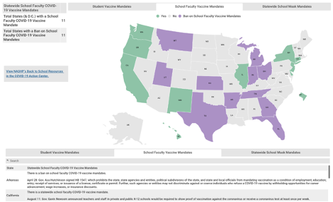
Consider that On July 1, 2021, a mere six months ago, the total COVID-19 deaths in the two sets of states (one group mandating school faculty vaccinate and the other banning school faculty mandates) was nearly identical - less than 1% difference between the two:
192,599 COVID-19 deaths in the 10 states requiring vaccinations for school faculty
193,974 for the 11 states banning school faculty mandates.
Since July 1, states banning vaccine mandates for school faculty saw their COVID-19 death rate increase relative to the states requiring it. Here are the incremental deaths over the past six months:
37,205 COVID-19 deaths in the states requiring vaccinations for school faculty (16% increase).
95,887 for the states banning school faculty mandates (33% increase)
There was less than a 1% difference in COVID-19 deaths as of July 1 – yet in the six months that followed, the predominantly Red States experienced 258% more deaths.
The same pattern is seen in examining the states requiring student vaccinations vs. states banning mandates for student vaccinations. Deaths grew at about twice the rate in the states banning vaccination mandates for students.
The difference in mandates is interrelated with politics and self-selected media choices, which appear to influence social distancing behaviors, mask wearing and overall vaccination rates. I am analyzing the difference in mandates as one of several indicators of how the Red State policies, lower vaccination rates and lower application of public health practices (masks, social distancing) are driving up the death toll in the US.
The political divide is stunning on two counts. First, there is a 32pt margin in the 2020 election separating the two groups of states requiring faculty vaccination vs those banning it. Second, perhaps even more stunning, is the reversal of Red States initially leading in early vaccination rates into March of 2021. Since these early vaccinations were mostly among those 65+, the differential booster rates are staggering. In essence, many Red State citizens that choose to get fully vaccinated in the first place are now deciding not to get boosted. The booster rate is less than half the rate of their Blue State counterparts. What explains this dramatic and deadly reversal?
My working hypothesis: since we know advertising communications can positively influence vaccination rates (as documented in my work with the Ad Council), it is reasonable to expect that negative communications by media personalities and broadcasters could have the opposite effect. It has been documented that FOX News content attacked vaccination and masking on a daily basis. Conservative email newsletters and social media channels may also play a role. Could these communications, over time, change the minds of those that regularly consume that media? Probably. The reversal in actions of the Red State 65+ population that was ahead of the curve on initial vaccination but is now far behind the curve on boosters creates an interesting research opportunity to study the influences on the change in behavior. (If you have data that would be useful in this research or are interested in supporting this research by Brown University School of Public Health, I would love to hear from you).
In sum, the latest data from the CDC finds a 5x higher risk of infection for unvaccinated and 14x higher risk of death. In my regression model predicting vaccination rates at the county level, politics became the most important factor after the per capita death rate. When the Brown University model predicts death trends by state, the differential rates of testing, masking and vaccination are the primary reasons why rates are higher in some states than others.
The year ended with 823,903 COVID-19 reported deaths in the US and 125,915 reported COVID deaths in Q4 2021. It is worth noting, thanks to vaccinations, deaths are down 10% from Q4 2020 (total reported deaths were 139,187 in 2020).
Forecast accuracy
Chart 1 displays the forecast vs actual incremental deaths from the Briggs-3 model for more than a year (back to when vaccinations were announced as imminent by the White House).
Chart 1: 1 month (left) and three-month (right) forecast vs actual COVID-19 Deaths
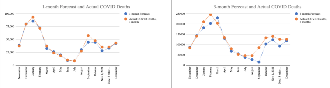
Both the one month and three month have slightly underestimated actual deaths, which indicates a slight bias toward more optimistic assumptions. Keep that in mind when you see my Omicron Q1 2022 forecast.
Below is a comparison of the accuracy of the Briggs-3 Model and the CDC forecast. The CDC has done a pretty good job at forecasting 4 weeks ahead. Empirically, my forecast (using a funnel conversion model approach) has done better.
Chart 2: Absolute value differences in monthly forecast vs actual
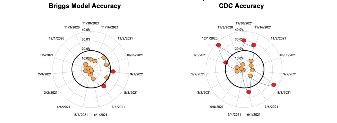 On-target chart: Orange dots represent projections within +/-20%, red dots miss the +/-20% threshold.
I believe my forecast has done better because the approach I am using, adapted from my Marketing & Sales Funnel Conversion Forecasting, is more forward looking.
Looking at chart 1, you can see there are many turning points in the trends. Models that depend mostly on past data, such as regression and ML, do a poor job anticipating the impact of future changes, such as a new variant. My hope is academics may try my approach in the future to improve the accuracy and insights of their modeling. Brown University is taking over the model and documentation to advance this goal.
I’ll offer an explanation of why the Marketing Conversion Funnel Approach has performed better by showing my work process on Omicron. Let’s examine what we know so far about Omicron and how we integrate that into the Q1 2022 Forecast.
Omicron
A Funnel Conversion Model only requires two inputs to produce a forecast: expected cases and expected conversion of cases to deaths. Historically, the conversion from case to death has been about 1.5% in an average of 21 days. In other words, for every 1,000 cases, we can expect 15 will be dead 21 days later. The questions for forecasting Omicron:
How much will cases rise?
How is Omicron different in terms of death rates and hospitalizations per case?
In early December, the need to forecast Omicron became apparent. But a backward looking model has to wait for the death rate to change. It has to wait for cases to increase before it can project the rise. Moreover, backward looking models rely on previous waves to calculate the likely peak. Don’t get me wrong, the autopilot version of my model uses prior patterns of CFR and cases too. But, like a Sales Forecasting Model in business, one can use the historic marketing conversion funnel data, or, one can use new data from test market experiments and project forward. In other words, one can consider how future activities might increase or decrease cases and the conversion of cases to hospitalizations and deaths. In essence, one can generate a data-informed projection that overrides the past patterns of case growth and case fatality rates to plot the future trajectory.
Last month, when the first case of Omicron was reported in the US, I noted we need about 50,000 cases by age cohort and vaccine status + 21 days to understand Omicron. Why that much data and time? If we start with the expected observations of hospitalizations and deaths from Delta, which has a Case Fatality Rate (CFR) in the US of 1.5%, 1,000 cases would result in 15 deaths, on average, 21 days after the case was identified. If Omicron produced 2 or 3 fewer deaths, it would be hard to draw conclusions with such a small sample size. Wait for 10,000 cases and compare the expected 150 deaths from Delta to Omicron and we can gain some insight, but 150 cases is still limited, because we should divide the deaths by vaccination status, age cohorts, and other variables to make sure we are making a like-for-like comparison. For example, how effective are boosters in reducing deaths? With only about one-third of the US boosted and big differences in booster rates by age cohort, the counts are too small to have confidence in the results. We begin to have enough data for reliable conclusions as we exceed 50,000 cases.
In Europe, where most of the countries identify more cases through more testing, their CFR is about one third that of the US. Therefore, they would need even more cases to determine the relationship between Omicron and deaths. Hospitalization is easier to analyze because there are many more hospitalizations than deaths, and they occur much closer to the identification of a case. Hospitalization, therefore, is used as a leading indicator for what will likely occur with the death rate. Predicting hospitalizations is useful to marshal resources to save lives.
A second problem presented itself as I tried to assemble the data: unlike Israel, which published weekly cases, hospitalizations and deaths by vaccination status and age cohort, countries where Omicron was taking off did not make such data publicly available. While it would be ideal to have case level data, in mid-December, with cases climbing in South Africa, and taking off in Denmark and the UK, but nowhere near enough person-level case data published, I had to look for alternatives. We needed insight before the holiday season so decision makers and others could consider the options. My contacts at Brown reported calls from both sides of the aisle looking for perspective on Omicron. I returned to a useful principle I learned when I worked at WIRED:
“The future is already here. It is just unevenly distributed.”
William Gibson
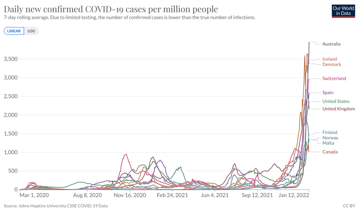
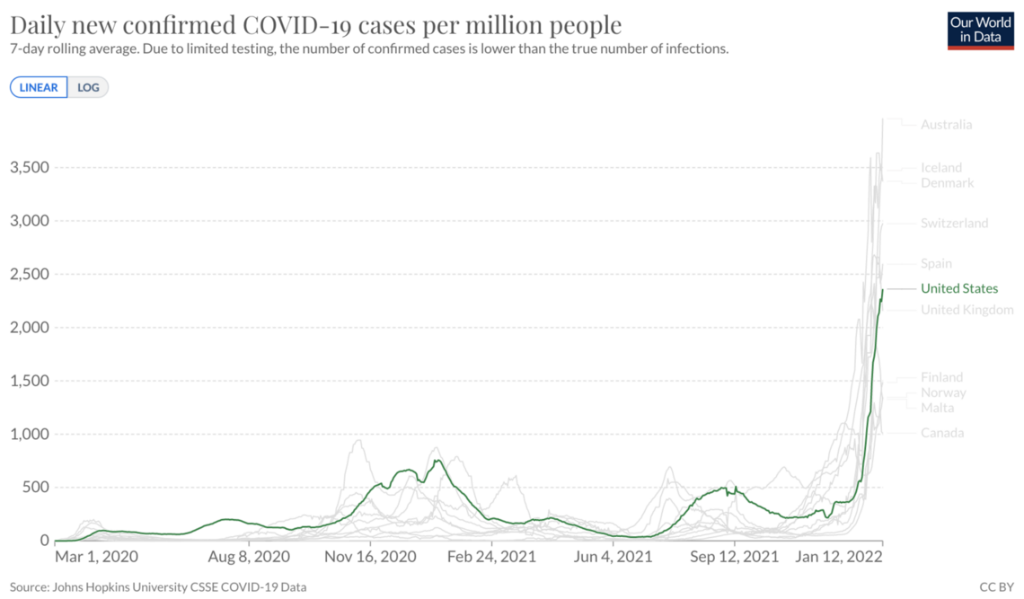
I searched through case curves in Our World In Data to find the characteristic Omicron acceleration to perform an aggregate (top down) analysis. I knew that I could compute the case growth rate and conversion to hospitalization to provide a forecast estimate of what we should expect from Omicron in the US.
I found Denmark, Norway, Spain, Switzerland and the UK showed the signature acceleration starting in November. I could use this data to gauge the case-to-hospitalization and case-to-death conversion rates. I could consider the magnitude of the new cases and look to see when each country hit a peak.
Chart 3: Cases per million, 7-day avg
 Source: OWID, UK (not graphed, but follow similar timing as Norway and Spain)
I decided not to use South Africa because my main goal was to use this data to forecast patterns in the US and Europe. South Africa has a different age demography, different vaccination levels and is in the summer season (vs. Northern Hemisphere in Winter Season). These, in my view, make South Africa data less useful for aggregate analysis. I skipped small countries like Luxemburg that are in the midst of a surge because their small populations make the hospital and death rate data less stable for analysis.
There were other countries that were just starting their surge, which I labeled as “Countries to watch (just starting to show Omicron signature surge, as of mid-December)”
Australia
Canada
Finland
Iceland
Malta
Using this list, I accessed the raw data from OWID and plotted the trends for cases, hospitalizations and deaths, as well as booster and overall vaccination rates.
I calculated an average decrease in the ratio of cases to hospitalizations of 60%. Switzerland, with the lowest boosted rate among the cohort (a rate still a little ahead of the US), had a lower 43% decrease. The UK saw a 57% decrease.
I took into consideration the likely prior infection rates (so called natural immunity). Spain and the UK had higher rates of prior infections per capita. Next, I considered case growth and the relationship to total infections to produce a forecast of where the peak would likely land. I plotted a trajectory, taking into consideration how death rates in the US increase as hospitals fill with COVID patients.
As I noted in my analysis to my partners at Brown University and contacts at HHS:
“Since the data is a weighted average of Delta and Omicron, and the trend is down as Omicron increases, it is possible the rates could improve, however, keep in mind our [previously shared] insight on the degree to which CFR increases as hospitals fill up. Over the summer, we saw CFR increase by about 25% when hospitals filled with COVID patients. If that occurs, it will nullify some or all of the less lethal aspects of Omicron. In addition, consider the US has lower booster, vax, mask rates. I don’t think we will do better than these 5 countries.”
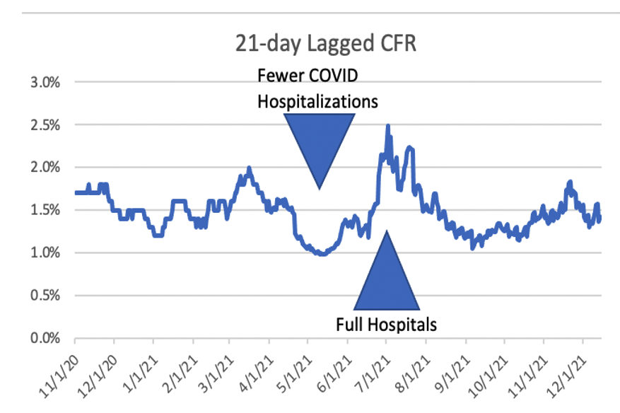
Chart 3: 21-day lagged Case Fatality Rate (CFR) in the US Nov 1, 2020 to Dec 1, 2021
Racing to have enough time to get the model into the hands of people of influence before the holiday, I sent the email with the forecasts of up to 1 million incremental COVID-19 deaths in the US by end of Q1, and a base case of about 350,000 incremental deaths if we flatten the curve.
I acknowledged my forecast was well above the CDC forecast through mid-January, and IHME’s forecast which looked out further, to three months. It was significantly higher than last year’s death toll for Q1. One million incremental deaths in Q1 would more than double the total death toll from 2020 and 2021 in 90 days. That seems incredible - as in not credible, but as one looks closer at the data, it is plausible. I noted that my forecast has been more accurate than CDC in 11 of the past 15 measurement periods, and more accurate than IHME in every measurement period over the past year except one.
Table 1: Dec 22 forecast for Jan 31 and March 31
(Note: Deaths on Dec 22 = 810,503. Incremental deaths to Dec 31 = 13,414)
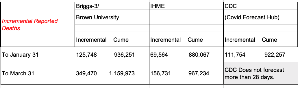
CDC’s forecast increased significantly on January 3. The forecast on Dec 22 was for 29,525 incremental deaths over the 28 days ending Jan 15. The Jan 3 forecast is for 91,798 over the 28 days ending January 29th. To compare to January 31 date, I used the 915,700 by January 29th cited in the CDC forecast, calculated an average of 3278.5 per day over the 28 day forecast and added 6,557 was added to the forecast.
IHME’s Worst Case by March 31 is 213,375.
Briggs/Brown University Best Case of deaths by March 31 is 181,833.
The forecast charts I sent are below. The Blue line shows what I initially termed “The Denmark scenario” where US cases increase by about 1,000% over mid-December weekly case counts (a peak of about 8.5 million cases per week). The problem this scenario poses is that CFR increases rather than decreasing because hospitals become overwhelmed. Considering polls that show a meaningful amount of mostly Republicans dismiss the voracity of the COVID case and death counts, and conservative media is focused on the lower severity of Omicron, this scenario assumes very little change in behavior among the unvaccinated and unboosted. School, work and church continue without much modification in the communities most at risk due to their vaccination status. Mask use remains low in these communities in this scenario, hence the wave is prolonged. In this scenario more than two-thirds of Americans become infected by the end of Q1 (PCR testing for official counts captures only about a quarter of the infections). Contact tracing and isolation breaks down. For the US, this is a plausible scenario. I re-labeled it “worse case” because it produced about 1 million incremental deaths in Q1 – about 5x higher than Q1 of last year – effectively doubling total deaths from 2020/2021 in the first quarter of 2022. This scenario is such an outlier compared to prior experience, and the CDC December 21 forecast that I developed the scenario represented by the orange line.
Chart 4: Case and CFR scenarios for Q1 2022
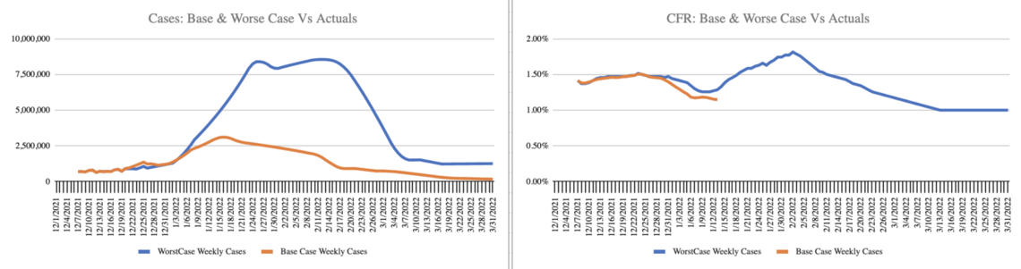
The orange line shows a rise in cases to about 3.5 million cases per week (a level we already passed at the publishing of this analysis), with a relatively early peak and gradual decline. CFR trends down initially and increases for a few weeks when hospitals are at their peak. It then declines to the levels predicted by the lower severity as hospital capacity eases and the best practice treatments become more broadly applied. In this scenario, about 350,000 people die of COVID-19 in Q1, up from 205,619 in Q1 last year. This is still a much higher forecast than CDC and IHME. In this forecast, about one in five Americans are infected with Omicron by the end of Q1. The mask wearing fully vaccinated and boosted can take some comfort in recognizing the majority of these deaths will be among those that choose not to be vaccinated. The choice to wear a mask and vaccinate/boost continues to confer a high level of protection.
In both scenarios, I estimated the delay in reporting through the holidays, by offsetting the growth curve by a week as several Red States and counties reduced reporting to weekly, and mainly on Friday.
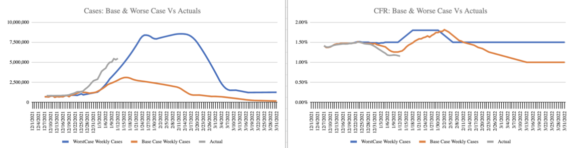
For Chart 5, I’ve added a grey line to track the actual cases and CFR trend. So far, three weeks after the initial forecast, cases are trending with the blue line “worse case” while CFR is trending with the orange line base case. I have posted a dashboard at www.speakerrex.com to track cases and CFR and deaths through Q1.
Chart 5: Case and CFR scenarios with actuals to date (in grey)
The best case (not shown in this chart) is for CFR to plummet as cases rise. 181,833 deaths in Q1 is down 13% from last year’s death toll. Perhaps Omicron, which doesn’t appear to attack the lungs in the way previous strains did, isn’t as deadly, even if hospitals can’t keep up with the level of care. We can monitor the data by tracking death rates among the countries that have started the surge earlier and engaging in person-level analysis of the outcomes. What about long-COVID? How will the rates and severity compare for Omicron? Unfortunately, we have to wait to know that answer.
Will cases shoot up as high as my “Denmark Scenario” forecast? It still seems incredible to forecast weekly cases increasing by 1,000% over early December. But, then again, cases have already increased over 600% since mid-December. Among the five countries I analyzed, and the five additional countries to “keep an eye” on, all have taken off - most above case levels per million above that currently reported in the US. Among the cohort, only Norway, which took special measures before Christmas to curb case growth, was able to flatten the curve. (Netherlands, it should be noted, and a few other countries not in the cohort, also took extensive action before Christmas, stalling transmission and buying time to increase capacity in hospitals.)
Chart 6: Countries with clear Omicron surges
New data
Since my mid-December forecast, more person-level data has arrived. Denmark analyzed 2,225 Omicron cases. Canada, about 6,000. The UK analyzed over 200,000. Each found about half the amount of hospitalizations compared to Delta.
Research from Denmark found fewer hospitalizations and went further at examining the chains of transmission. The study found that unvaccinated were twice as likely to transmit Omicron and twice as likely to become infected. The implication for the US is that areas with lower vaccination rates will be hit harder as Omicron spreads.
There has not yet been an effort at a Meta Analysis to combine the studies, so I’ll replay the key results of the largest among the studies, the UK Study.
Overall: UK study suggests Omicron is less severe than Delta with 53% fewer hospitalizations per 100,000 cases (remarkably close to the 57% decrease observed in the aggregate data trends).
With Omicron, Vaccines reduce:
Symptomatic infection
Hospitalization (by 65% with 2 doses, and 81% with three)
Deaths
The UK study showed that by 20 weeks after the most recent vaccine dose, protection wanes.
The research shows Omicron is proficient at evading immunity, especially that induced via prior infection as opposed to induced by a vaccine booster.
Implications
Because there are so many more vaccinated people than unvaccinated people, expect to know more vaccinated people with a breakthrough infection – even though the odds of infection are higher for an unvaccinated person.
Omicron has shifted the ratio of infections from unvaccinated and vaccinated. Before Omicron, unvaccinated were 5x more likely to test positive for COVID and 14x more likely to die of COVID (10x more likely to test positive compared to booster 20x more likely to die compared to a booster). The gap will narrow with Omicron, perhaps to 2x, based on the data from Denmark. Still, even with a 2x difference in infections and 2x difference in transmission reported in Denmark, if this ratio is similar in the US, about 70% of all infections and transmissions will be driven by the unvaccinated.
With skyrocketing cases in the US, we are likely to see hospitals fill up, even though an Omicron infection, overall, is less likely to require hospitalizations.
Keep in mind, the UK has higher vaccination and booster rates than the US, so the US may see less of a decline in hospitalizations. I did not create a vaccination to hospital rate regression because five countries were too few. The five countries to “keep an eye on” have all seen the surge continue, and therefore the 10-country cohort may provide enough data to refine the projection of hospitalization rates as a function of vaccination rates in a country, state or county.
Considering that Red State and Red Counties in the US are half as likely to get the booster, we can expect higher hospitalization and deaths in these Red State regions.
The Denmark study showed vaccination and boosters reduce transmissibility. An unvaccinated person is 41% more likely to transmit and infect another household member than a person with two doses. An unvaccinated person is twice as likely (196%) to transmit and infect another household member compared to a boosted person. Therefore, a model should factor in the population of unvaccinated, vaccinated and boosted to predict where transmissions will grow faster. This suggests Red States and counties, with lower vaccination and booster rates will fare worse.
Coming off the Holidays and back to school/work, I expect cases to continue to climb in the US and peak around mid to late January. I expect this peak to offset the lower rate of hospitalization, causing a net increase in hospitalizations, and likely causing hospitals in the harder hit areas to run into capacity challenges, and therefore worse outcomes for patients. My hope was there might be some policy actions that would avert what I initially labeled “The Denmark Scenario.”
Is it really possible for US hospitals to fill, and the number of dead Americans from COVID to double in a matter of a few months?
Consider where the US is in this curve today relative to the UK and Denmark, and what hospitals might look like if we double again to approach where Denmark is now.
Chart 7: US cases per million people relative to counties with Omicron surges
The key variables to watch beyond cases are 1) hospital capacity and 2) Case Fatality Rate. Don’t ignore cases – they are a leading indicator. Focus on hospital rates (and more precisely capacity) as it will indicate if/when US enters a phase where CFR increases not due to Omicron being worse (Omicron is less severe), but because our hospitals simply can’t care for all the COVID patients. Look for more data on the average time from infection to death. A note in the UK data suggested it may be 5 days, on average, but that was based on only 57 deaths. Still, if it is significantly less than the 21-day average for previous variants, it would mean a much lower CFR, which would be welcome news, pushing us toward the best case scenario.
The hope is that the very thing that makes Omicron more contagious (that it doesn’t settle in the lungs) is also what makes it much less deadly – and this averts a doubling of the COVID death toll in the US in this quarter. However, hope is not a data point. The data points we have suggest Omicron will continue to be driven by the unvaccinated, and they will likely experience worse outcomes.
The unvaccinated 65+ (12% of the 65+ population) and the unboosted 65+ (29% of the 65+ population) are likely to account for the largest share of deaths in this wave. We will continue to see younger unvaccinated die and fill up hospitals as well. Particularly troubling are unvaccinated children filling up the pediatric wards and the unknown implications of Long COVID for a generation of kids. We will see a lot of vaccinated people become sick, but it will be rare (though not unheard of) for a person under 65+ that is fully vaccinated and boosted to die as well. We will change our definition of “fully vaccinated” to be someone that is boosted within the past four months. I would not classify a person who received their last dose nine months ago as vaccinated.
There is a significant Booster political divide in the 65+ age cohort. The unboosted and unvaccinated 65+ will bear the brunt of this wave. In addition, even though the unvaccinated are the minority of Americans (27% of adults), if we combine this group with the unboosted 65+ (5% of Americans) it represents one-third of total Americans. This minority of unvaccinated will make up the majority of transmissions and take up the majority of hospital beds. Applying the observations from the Denmark Study, the unvaccinated will be responsible for over two thirds of new transmissions. That said, vaccinated people can get and transmit Omicron too (not at the same rate, but the risk is not zero). Please consider how you can be part of the solution to reducing transmission, especially over the next 30 days, when hospital capacity is likely to hit a wall.
My implications for my friendsBe cautious of indoor settings where you don't know the vax status of those around you. My forecast expects 1 in 3 unvaccinated people to be infected in the next 90 days. Considering the contagious period, if you are in an area with 20 unvaccinated people, such as a store, the odds are at least one of them is infected and contagious. Consider unvaccinated are half as likely to wear a mask, that person in the store without a mask, assume they are unvaccinated and there is a chance they are contagious. Wearing a good quality mask (KN94 or N95 respirator) and keeping your distance from the unmasked in these settings is a good idea. Washing hands and being aware of rubbing eyes before washing hands is always a good idea. (One study found that those who wear glasses were less likely to contract COVID because they rub their eyes less, and that reduced one of SARS-CoV-2 pathways in).
I expect hospitals in many areas of the US to fill in mid-January as cases continue to shoot up over the next two to three weeks. This might not be the month to take up base jumping or other activities that might require medical attention if it goes wrong.
Consider engaging family and friends that are unvaccinated or unboosted in an open discussion. Probe what they believe about Omicron. Ask them to project their assumptions to a forecast. If they believe it is not very serious, then deaths should go down this month compared to last (There were 43,063 COVID-19 deaths in December). Ask them to follow up so you can compare estimates and discuss what it means if the direction of the pandemic was different from what they believed. If they are right, it is a reason to celebrate. If they are wrong and COVID deaths increase rather than decrease, perhaps there will be an openness to consider vaccination, better masking, etc.
If it has been more than five months since your last vaccine dose, get boosted. Remember, it takes about two full weeks for your body to build the immunity from the booster that provides the added protection.
If you are fully vaccinated, boosted and over 70, or are immunocompromised, the risk remains high with Omicron. Hopefully, those around you will be fully vaccinated and boosted, and will wear good quality masks to offer more protection for you.
If you are under 60 and fully vaccinated and boosted, know you are the majority, and Omicron is less severe. Wear a good quality mask (KN94 or N95) when in public to be safe. Enjoy life. You may get Omicron. It may be a lousy week feeling sick, but the fully vaccinated and boosted should keep the vast majority in this age cohort and vaccine status out of the hospital.
It is possible we will see disruptions in supply chain and services based on increased infections. Plan accordingly.
If you have connections to Red State leaders or conservative media commentators, encourage them to use Omicron as an opportunity to reset what we know and walk back bans on vaccinand mask mandates. It is counter-productive to politicize vaccinations and masks – and it is disproportionately killing their constituents.
I’m keeping an eye on CFR and hoping Omicron will behave differently with far fewer deaths per 1,000 cases – I’m hoping Omicron will behave differently because I have given up hope that the unvaccinated will behave differently.
Rex Briggs
Consultant and Author at Marketing EvolutionRex Briggs was named one of the dozen “best and brightest” in media and technology by Adweek, and one of the people to “watch and learn from” according to Brandweek. He has been honored with the Atticus Award for his work in direct marketing, the Tenagra Award for outstanding contribution to branding and ESOMAR’s Fernanda Monti Award for his work in CRM. Rex has also won international research awards for his work in understanding website effectiveness and online advertising. His work in understanding the effects of advertising in television, magazine and online was nominated for the prestigious John and Mary Goodyear Award for best international research. Rex was the first director of research for the Internet Advertising Bureau (IAB), and pioneered attribution analytics. His research has been translated into a half-dozen languages and he has taught at leading universities around the world.
Rex is the best-selling author of “SIRFs-Up – How Algorithms and Software are Changing the Face of Marketing.” The book tells the story of how brands can better optimize advertising spend with equations known as “Spend to Impact Response Functions” (SIRFs) and how they will become an integral tool for marketers of every size and vertical for allocating budgets and forecasting business results. Rex also is the best-selling author of “What Sticks: Why Most Advertising Fails and How to Guarantee Yours Succeeds.” The book draws learning from ROI measurement from 36 major marketers. The studies were designed by Marketing Evolution to track media expenditure in real time and offer solutions on how marketers can improve ad effectiveness. “What Sticks” was named the #1 marketing book by Advertising Age, and was featured on CNBC, Bloomberg, CNN, NPR and The Economist. Rex is an instructor for the Association of National Advertisers’ (ANA) School of Marketing, where he holds workshops on ROI measurement technologies and IMPACT Marketing.
Rex founded Marketing Evolution in 2000 and sold his interest in 2019. He is an independent consultant and author. Rex is known as one of the world’s leading experts in marketing ROI measurement and optimization technologies. His expertise derives from direct experience measuring and improving the performance of a wide range of marketing programs for more than 100 Fortune 500 marketers.
Article series
COVID-19 impact
- Making healthy habits stick after COVID
- Shobservatory Research Chronicles: Lockdowndiaries
- Capturing early stage consumer feedback, post-COVID
- Evolution of physical space in retail and hospitality
- November 2021 COVID-19 forecast & commentary
- Ethical brands in pandemic times
- November 14 reforecast due to OSHA rule stay
- COVID-19 December 2021 forecast for the USA
- Omicron
- COVID-19 forecast in the USA
- COVID-19 update for the USA
- COVID-19 Omicron retrospective
- Crises and community
- Research that makes a difference